Visualizing Your Data With MongoDB Charts

Having data stored in a database is practically a given for today’s businesses. Customer information, order history, product pricing, IoT sensor data, and much more is being recorded for future use. However, just having the data stored isn’t enough to form a competitive market advantage. We must be able to analyze the data as well. There are many options to do so and in a variety of ways. If you have data that needs to be visually analyzed in MongoDB, MongoDB Charts is a terrific option.

Prior to MongoDB Charts, there were really three ways to visualize your MongoDB Data.

  1. Leverage the MongoDB Business Intelligence (BI) Connector in conjunction with third-party BI tools,
  2. Perform Extract-Transform-Load (ETL) operations and leverage third-party tools, or
  3. Write custom code and use charting libraries such as D3.js or Bokeh.

MongoDB Charts Benefits

MongoDB Charts, currently in Beta, provides an easy way to visualize your data living in MongoDB. You don’t need to move your data to a different repository, write your own code, or purchase third-party tools. MongoDB Charts knows and understands the richness of the Document Data Model and allows for easy data visualization.

Further, MongoDB Charts allows for a secure way to create and share visualization dashboards with everyone, or just targeted team members. Similarly, the data source being used behind the scenes can be shared securely as well. For example, data for the Sales Department doesn’t have to be made available to Marketing unless needed. Very powerful and follows MongoDB’s design of security being a top priority.

After downloading the MongoDB Charts Docker image and following the installation instructions, we’re able to connect to a data source stored in MongoDB Atlas and start making visualization dashboards. Once connected to the MongoDB Charts server, there are three steps we need to take:

  1. Add a data source
  2. Create a dashboard
  3. Create our charts

Analyzing Airbnb Data with MongoDB Charts

I have set up a database with some Airbnb data from various cities. We’ll be exploring the dataset from Seattle, WA here, but feel free to explore others on your own. We need to get the connection string from the Atlas Cluster that has our data and connect to it in Charts.


Get URI From MongoDB Atlas for MongoDB Charts
Get URI from MongoDB Atlas

Add a Data Source

With our MongoDB Charts server running on localhost:80, we can log in and head to the Data Sources tab. We use the URI from Atlas (mongodb+srv://airbnbdemo:airbnb@airbnb-rgl39.mongodb.net/test?retryWrites=true) and select Connect. We’re next asked which data source we want to use from that cluster, I’ll select the seattleListingAndReviews from the airbnb database for this example. For permissions, I just want to keep everything private so I’ll accept the defaults and select Publish Data Source. Once published I can add an alias to the data source. I’ll call it Airbnb Seattle.

Note: The URI above contains a sample URI. You should connect to your own Atlas Cluster and use an authorized username and password.

Create a Dashboard

Next up is to create an actual dashboard to house our visualizations. In the Dashboards section choose New Dashboard and give it a name and description, like Ken’s Airbnb Dashboard. This will take me to where I can add charts to my dashboard.

Create a Chart

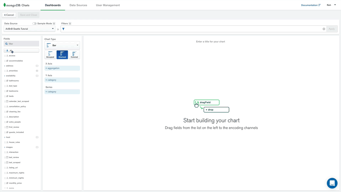
After clicking on the Add Chart button we can start building our visualization. We’ll want to choose the Airbnb Seattle data source from the drop-down. MongoDB Charts automatically determines which fields are available for exploration. For this exercise, I’d like to see which neighborhoods in Seattle have the most Airbnb properties and split them by property type. We’ll use the Stacked Bar chart for the type.

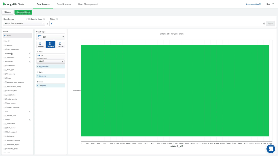
    1. For the X-Axis then, we’ll want the id field, aggregated by count.

Assign X-Axis value in MongoDB Charts
Assign X-Axis value to a MongoDB Chart
    1. Along the Y-Axis we’ll look at the address and the suburb. Notice that address is a subdocument here and that MongoDB Charts natively knows how to handle this type of data. I’d like to sort the suburb by aggregated value, in descending order, and limit our results to the top 20 suburbs.

Assign Y-Axis value to a Stacked Bar in MongoDB Charts
Assign Y-Axis value to a Stacked Bar chart
    1. Let’s add the property_type field as our series

Assign a Series value to a Stacked Bar chart in MongoDB Charts
Assign a Series value to a Stacked Bar chart

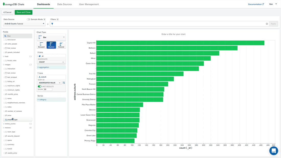
Now we can name our chart, Properties by Location and save it. We’re then taken back to our dashboard where we can add other visualizations for further exploration.

Have a look at this short video to see some other visualizations being created from this same data source.

Conclusion

MongoDB Charts is an excellent new tool to visually explore your data. It has some great features for specific use cases, such as:

  • Ad hoc analysis of your data
  • Natively understands the benefits of the Document Data Model
  • Collaboration on projects is easy with user-based sharing and permissions
  • It’s intuitive enough for non-developers to use allowing for self-service data analysis

MongoDB Charts is the fastest way to build visualizations over your MongoDB data. I’d encourage you to download it and try it out today. Let me know what visualizations you come up with from the Airbnb dataset. I always enjoy seeing how people explore their data.


This post was first published on the MongoDB blog.

Facebooktwitterredditlinkedinmail

MongoDB Compass: An Overview

When I first started using computers, everything was done through the command line. Everything. Apple had yet to come out with the Macintosh, Windows was not even a glimmer in the eye of Microsoft. For that matter, Microsoft wasn’t a glimmer yet. Everyone got used to living in the shell and knowing a multitude of commands, arguments, and syntax to achieve even the smallest of tasks. Along came the graphical user interface (GUI) both in terms of operating systems and a variety of tools. Many of these tools provided much of the functionality that could be achieved in the command line, certainly, the majority of the most common tasks were included in an easier to use and visualize format.

This is the case for MongoDB‘s Compass product. Since it’s original release in December of 2015 several versions and upgrades have been added. As of this writing, we are now on version 1.6. Like many GUI tools, it aims to offer an easier interface for accomplishing many tasks one might otherwise do in the mongo shell. In this post, I’d like to take a look at some of the more useful features that Compass provides for managing your MongoDB databases and collections.

MongoDB Compass Features

One of the great features of MongoDB is that it has a flexible data model. This is a powerful feature for schema design. However, from the shell it can pose limitations on knowing the exact makeup of a collection’s schema. Compass provides a visual interface which samples a subset of the data in a collection and analyzes the documents from within this subset.

Data Vizualization

This provides an easy to see snapshot of how the collection is designed in an easy to use GUI fashion. One gets immediate information on types, ranges, and frequency of fields in a collection. This allows for the ability to easily choose, sort, and query the collection. All based on the data presented in the schema visualization. The same results can certainly be obtained with shell commands. However, the time and effort involved to get there is much greater.

Database & Collection Interaction

This feature alone in Compass makes it worth the download, but there is much more! Creating and dropping databases and collections is possible in Compass and, as I pointed out in a previous post on indexing MongoDB collections, indexes can have a huge impact on the performance of queries. Compass provides an intuitive interface for index creation. Once created it provides detailed feedback about the performance of a query. And what and how many steps and time MongoDB had to go through to return the documents.

Index Creation
Create Index with Compass
Index Used
Find with a defined and used Index

Once again, all of this can be done in the shell right? We can create an index in the shell with db.collection.createIndex() and we can get explain results in the shell as well. I might argue though that the creation of indexes in Compass is easier with many of the various index creation nuances during the creation step. Further, being able to see the results of the explain plan visually is of benefit, of course, you can also see the raw JSON as well for a more in-depth look at the results.

Dev-Ops features

The last of the features that I want to discuss in this post is the ability to get insights into some of the operational aspects of the database itself. Compass provides a GUI interface for server performance for the metrics of Operations, Read & Write, Network, and Memory usage. It also provides information on the Hottest Collections. Meaning the collections with the most activities as well as information on slow running queries (potential candidates for indexes here). All the information can be obtained from the command line using various tools that come with MongoDB, such as mongostat and mongotop, and the profiler for slow queries. Once again, the GUI interface provided by Compass provides, in my opinion, an easier way to grasp what is going on with the MongoDB Server.

Wrap Up

I realize that Compass is not the end-all answer to MongoDB management. Not all functionality of managing and maintaining a MongoDB database server and associated collections is possible. There are still tasks that currently still require using the command line. Heck, I still wind up using the command line to perform tasks in Windows and OS X. However, for a product that has only been out for less than a year and a half, this is a great start.

Compass has a lot more features that I didn’t cover here, I would encourage you to download it for your Windows, OS X, or Linux system and discover a new way to visualize your MongoDB data and graphically manage your system.

There are a lot of MongoDB specific terms in this post. I created a MongoDB Dictionary skill for the Amazon Echo line of products. Check it out and you can say “Alexa, ask MongoDB what is the definition of a collection?” and get a helpful response.


Follow me on Twitter @kenwalger to get the latest updates on my postings.

Facebooktwitterredditlinkedinmail