
Nine years in, I finally worked out what else to count.
A writer I follow, Sylwia Laskowska, recently published a post about accidentally becoming a blogger. She has been writing on DEV for about a year, and the numbers attached to that year are impressive: hundreds of thousands of views and tens of thousands of followers.
I have been on DEV for more than nine years. This morning I am at 48,408 total views.
Before I go any further, I want to be clear about something, because the essay that usually follows a comparison like that is insufferable. Building a large readership for accessible, useful developer writing is genuinely difficult, and doing it in a year is more difficult still. I would like more people to read my work. I can learn a great deal from writers who are better than I am at audience building, topic selection, accessibility, and community participation.
So this is not a piece about why small numbers are secretly good. It is a piece about what I spent nine years failing to separate.
The number that stopped me using one of my metrics
I recently pulled nine years of my own data out of the DEV API, mostly to make a chart of follower growth with my publication dates marked on it, so I could see which posts moved the line.
The chart was useless, and the reason is instructive.
In 2026 I gained roughly eighteen thousand followers. My 2026 posts have about fourteen thousand views between them. You cannot acquire eighteen thousand readers from fourteen thousand page loads. The daily follow rate sits around 130 and does not respond to whether I publish anything, and about 37% of the usernames carry auto-generated hex or numeric tails. It is reciprocal-follow farming, it is endemic, and it has nothing to do with me or my writing.
Here is the cleanest version of it. Since the middle of September, my follower count has gone from 18,148 to 21,048. Over the same fifteen days, my total view count went from 46,774 to 48,408.
Two thousand nine hundred new followers. One thousand six hundred and thirty-four new views.
I gained nearly twice as many followers as readers, and a follower is supposed to be a reader who liked something enough to want more. That number had been sitting on my profile for months looking like evidence of something.
A page view is at least an honest measurement. Somebody loaded the page. That is real information, and I think “vanity metric” is an unfair label if it is taken to mean meaningless.
The trouble starts when we quietly change the claim from “this post received more views” to “this post was more successful.”
Successful at what?
A page view is real. It just is not the whole story.
In corporate content the answer to that question is usually explicit. A post might exist to attract someone searching for a problem, introduce a product, move that reader toward a trial, and eventually help create a customer. Ten thousand views with no downstream behaviour may be worth less to that company than five hundred views that put twenty qualified developers into the funnel.
Personal writing has a funnel too, just a much vaguer one. Someone reads one article, encounters another a month later, starts recognising the name, follows, leaves a substantive comment, references the work elsewhere. The page view was real. It was not necessarily the outcome.
It also helps to remember that a broadly useful JavaScript tutorial and an article about authority boundaries in AI-generated software are not competing for the same reader. One is relevant to a large share of a developer community. The other starts with a much smaller pool of people who already care about capability security and the distinction between correctness and authority.
That is not so different from comparing the audience for a popular fantasy novel with the audience for a presidential memoir. Both books can be excellent. Both can do exactly what their authors intended. Their potential readerships are still radically different.
Audience size is partly a property of the artifact and partly a property of the market around it. That sounds obvious about books. Writers forget it remarkably fast while staring at a dashboard.
An article can also have a desired consequence without a button under it. Sometimes I want someone to challenge the argument. Sometimes I want a developer to recognise a problem in their own system. Sometimes the entire intended outcome is that a reader leaves with a question they were not asking ten minutes earlier. That still gives me something to evaluate against. It just refuses to appear as conversion=true in an analytics dashboard.
Quality, audience fit, and distribution are different problems
I have come to think of online writing as at least three separate problems.
Writing quality is the craft problem. Is the argument coherent? Is the explanation useful? Did I do the research? Is there something here worth another person’s time?
Audience fit is the relevance problem. How many people where I publish are likely to care about this subject? How much prerequisite knowledge does it demand? Can someone scrolling a feed see immediately why the question matters to them?
Distribution is the discovery problem. How does the article reach those people? Search, followers, newsletters, speaking, community participation, platform curation, links from other writers, or some combination.
Those interact, but they are not interchangeable. An article has to clear all three, and failing any one of them produces the same disappointing number for completely different reasons.
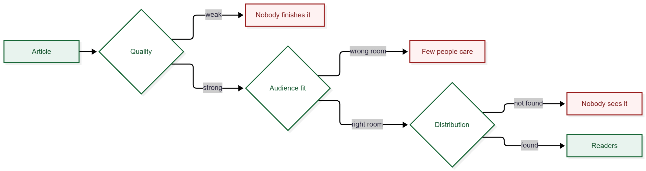
That is the diagnostic value of separating them. Three posts can land at 80 views apiece and need three entirely different responses. A good article can have poor audience fit. An accessible article can have excellent fit and no distribution. A technically modest piece can answer a question a hundred thousand people are asking today. A strong argument can address a question five hundred people know they have.
For most of my writing life I concentrated almost entirely on the first variable and assumed distribution would sort itself out. Sometimes it did. Frequently it did not. My own numbers say that plainly: about 4% of my traffic comes from search, which for someone whose best-performing historical work is evergreen reference material is a distribution problem rather than a quality one.
I did not start with a content strategy
Nine years ago my public technical writing grew out of databases, because databases were the work I was doing and the community I was in. I did not sit down with a personal-brand document. I wrote about what I knew, what I was learning, and what developers were asking about.
Those articles accumulated into something larger. People began associating my name with certain subjects, questions led to more articles, and some of that work became durable enough to keep attracting readers years later. My database writing eventually included MongoDB’s Building with Patterns, one of the most heavily visited bodies of content I worked on there.
That history matters when I wander. If I publish one Rust article today, it does not arrive with nine years of association between my name and Rust behind it. That does not mean developers are uninterested in Rust, or that my readers dislike it. It may simply mean I have not given a Rust audience any reason to know who I am.
Those explanations imply completely different responses. If I wanted Rust to become a real part of my writing, one underperforming article would tell me almost nothing. I would need several useful pieces, participation in that community, and time. If I do not want that, the article stays an interesting experiment.
“This article performed poorly” is an observation. “There is no audience for me here” is an interpretation.
Personal writing gets to discover its strategy
I have spent enough of my career around corporate developer content to know that content strategy matters. A company generally knows why it is publishing: which developers it wants to reach, which capabilities it needs explained, which search terms it wants to own. The strategy should exist before anyone fills the editorial calendar.
Personal writing is stranger. You can chase a question because it bothered you on Tuesday. You can abandon a series when you have nothing else useful to say. You can spend weeks on a technical experiment and then publish something ridiculous because you started wondering whether all the photographs on your phone technically make it heavier.
You can also discover the strategy after you have written enough to see the pattern. That has increasingly been my experience. Articles I thought were about AI verification, provenance, missing information, audit evidence, memory, and authority turned out to be different views of the same few questions. I did not design that body of work and then manufacture articles to fill it. The writing is how I found it.
The conversation that prompted this piece made me realise that is less different from corporate strategy than I assumed. Sylwia described writing mostly by intuition while still making choices about what she wants to be known for, which audiences interest her, which adjacent topics fit, and which opportunities she ignores.
That is a content strategy. It just has a governance structure of one.
A company may need content, DevRel, product marketing, SEO, and leadership involved in deciding whether a newly discovered audience matters. A personal writer can notice something in the comments on Tuesday and run the experiment on Thursday. The strategic question is nearly identical. The path from observation to decision is not.
Signals are not instructions
This matters because audiences talk back. A recurring question in the comments may reveal an adjacent audience you did not know you had. Search traffic may show people finding an article for a reason you never anticipated. A series may attract platform engineers when you thought you were writing for application developers.
That is useful information. It is not an order.
A writer can discover that beginner tutorials have an enormous reachable audience and still decide not to build a body of work around them. A company can discover that a group of users loves a product for an unexpected use case and still decide that market does not fit the strategy.
Discovering an audience is not the same as deciding to serve it.
This is where “write more of whatever did best last week” collapses. It is the same loop with one step deleted.

The diamond is the part that gets skipped. Without it the loop still runs, it just runs on autopilot, and the writer ends up somewhere chosen by whatever the feed rewarded in a given week.
Metrics tell you what happened. Readers reveal opportunities you did not know to look for. Neither one gets to decide what you want the work to become. The feedback loop needs interpretation.
I eventually wrote down some rules
Once I could see a body of work forming, it became tempting to turn every passing thought into another strategic article. So I wrote myself a gate.
For the deliberate part of my technical writing, I now ask whether there is a disputable claim, whether investigating it will put pressure on an actual artifact, whether I have standing through a project or experiment, whether it advances rather than repeats the larger body of work, and whether a reader should do or question something differently afterward. I also want to know what would falsify the claim before I start assembling evidence for it.
The artifact-pressure test is deliberately hard. If investigating an idea will not change code, a specification, an ADR, a schema, or a demo, it probably does not belong in that stream. The investigation also has to be capable of failing. Building fixtures that encode what I already believe proves very little.
That produces a shape I have become fond of:
Here is what I thought.
Here is what would have convinced me I was wrong.
Here is what I built.
Here is what happened.
Here is what changed.
Those are not my rules for everything. I deliberately keep another lane with almost no gate at all: career observations, language experiments, satire, community responses, project archaeology, and pure curiosity only need to be worth writing.
A publishing strategy should help me recognise strong work. It should not make me ask permission before being curious.
Some of it is luck
There is one variable I cannot put into a strategy with any confidence.
I can study years of data and conclude that Tuesday at 9:00 a.m. Pacific is the right time to publish. That says nothing about whether it is right for this article. A major news event may take the morning. Three other posts aimed at the same readers may appear within the hour. A moderator may promote something. A Gem may land. Another writer with a large audience may link to you. None of that says anything new about the quality of the work, and each can transform its distribution.
Strategy does not eliminate luck. It changes the conditions under which luck operates. You can improve the writing, understand the audience, participate in the community, publish consistently enough that people know you exist, and make the work easy to find.
You can engineer more opportunities for an outcome without engineering the outcome itself.
And when luck does hand you an unexpected success, strategy comes back. A surprising audience appearing is another signal, not a mandate. You still have to decide whether it points somewhere you want to go.
What I actually track now
I still look at views. Pretending otherwise would be silly. If one article gets 5,000 and another gets 40, I want to know why. I just no longer think the first was 125 times more successful.
The outcomes I care most about do not fit in a platform dashboard. A reader challenges a claim and I change the model. A comment exposes a missing invariant. An experiment breaks the answer I expected to publish. An article changes code, a specification, or an architecture decision.
That has become much less theoretical lately.
I published an article that began with a refractometer and a batch of homemade wine, arguing about the difference between a measurement and the state we infer from it. The comments pushed it considerably further: version the correction rule, spend more measurement budget on consequential baselines, decide how conflicting instruments get adjudicated before seeing the readings, distinguish evidence that survives a restart from evidence that dies with the process.
An article about authority boundaries in AI-generated code did the same thing. Readers pushed on capability lifetime, consumable authority, semantic authority diffs, denied-call telemetry, and who is permitted to modify the authority boundary itself.
Those comments did not just increase engagement. They changed the model. Those are propagation effects rather than distribution metrics, and I have started tracking them separately: research-induced change, engagement from people with standing outside my field, independent use of a concept, substantive challenges and extensions, and whether writing has started consuming so much time that the projects supplying it have stopped moving.
My numbers support the split more cleanly than I expected. Across nine years I have 1,372 reactions and 683 comments. Roughly one comment for every two reactions is a strange ratio, and it is concentrated almost entirely in recent work. My 2017 tutorials pulled more than twice the traffic of everything I wrote in 2026 and produced 26 comments in three years. The 2026 essays, with a third of the traffic, have produced hundreds. One of them has a comment thread 35 replies deep.
One body of work got found and skimmed. The other gets read and argued with. For years I evaluated both with the same number.
A related consequence: a technically unsuccessful investigation can make a successful article. If I start with a hypothesis, state what would falsify it, build something capable of producing an answer I do not control, and find out my model was wrong, that is useful. Possibly more useful. It tells the reader something, it changes the artifact, and it often exposes a better question than the one I started with.
I have a line in my current content plan that says missing a publishing day beats manufacturing a weak post. Nine years ago I am not sure I would have been comfortable with that.
Nine years later
I am still working this out. I still publish things and wonder whether anyone will care. I still occasionally write something I expect to perform well and watch it vanish. I still publish something on a whim and find it landed exactly where it needed to.
The difference is that I now have more ways to recognise success when it shows up wearing something other than a large number.
A successful post might reach 30,000 people. It might produce a conversation that changes the next article. It might expose a flaw in an architecture. It might give someone language for a problem they were already having. It might lead to code. It might turn out to be part of a body of work whose shape I could not see when I wrote the first piece.
And sometimes it might simply be an article I wanted to write, written well enough that I am still happy to have my name on it years later.
Views measure views. They are a real measurement of a real thing, and they do not independently measure rigour, usefulness, influence, audience fit, changed behaviour, changed artifacts, or whether the writing moved me toward a better question. Sometimes those correlate. Sometimes they do not. Mine told me almost nothing for nine years, and the twenty-one thousand followers told me less.
The useful question is not “Was this post successful?”
It is “What did I want this post to do, and what happened because I published it?”
Those are much harder numbers to put on a dashboard. I think they are also the ones worth learning to notice.
Thanks to Sylwia Laskowska for the conversation that prompted this, and for the encouragement to write some of it down.