
There is an API. It will tell you things about your writing that the dashboard will not.
I have been publishing on Dev.to since April 2017. There is a four-year hole in the middle where I posted almost nothing, and then a return in March 2026 that has produced eighty-six posts in six months.
That shape turns out to be useful. Two distinct bodies of work, on the same account, separated by a gap long enough that the platform itself changed underneath them. A natural experiment I did not set out to run.
What I wanted was simple: a chart of follower growth with my article publication dates overlaid, to see whether particular posts moved the line. What I got instead was a fairly uncomfortable education in which of my numbers mean anything.
The API made all of it possible, and almost nobody seems to use it.
Yes, There Is an API
Base URL is https://dev.to/api`. You generate a key at **Settings → Extensions → DEV Community API Keys**. Most read endpoints for your own data want that key in anapi-key` header.
There is one detail that will silently ruin your afternoon:
headers = {
    "api-key": key,
    # Omit this and you get v0 responses. No error. No warning.
    "accept": "application/vnd.forem.api-v1+json",
    "user-agent": "my-analytics-script/1.0",
}
Without the accept header you are served the older v0 serializer. Nothing fails. The shapes are just quietly different, and you will spend twenty minutes wondering why a documented field is missing.
Trick One: The Default Page Size Is Not the Maximum
The followers endpoint is documented as returning 80 per page. I have a little over eighteen thousand followers, which is 227 round trips.
The v1 pagination range actually runs to 1000. The 80 is a default, not a ceiling:
batch = client.get(
    f"{API_ROOT}/followers/users",
    params={"page": page, "per_page": 1000},
).json()
Nineteen requests instead of 227. Thirty-one seconds instead of however long 227 polite requests would have taken.
A Forem instance can cap per_page lower through an environment variable, so do not hardcode the assumption. Ask for the maximum, then learn the real stride from what comes back:
if page == 1 and len(batch) < requested:
    # Either the server capped us or that is the entire list.
    # Either way, this is the real page size.
    page_size = len(batch)
Rate limiting is real and it is not gentle. Back off on 429, sleep between pages, and checkpoint your merged results to disk every few pages. A long first pull that dies on page 190 should not discard the previous 189.
Trick Two: Follower Dates Reconstruct History You Never Recorded
This is the single most useful thing in the API and it is easy to miss.
/api/followers/users returns a created_at on every follower: the date that person started following you. You do not need to snapshot your follower count daily and wait six months to accumulate a time series. One pull reconstructs the entire curve retroactively, back to your first follower.
from collections import Counter
from datetime import date, timedelta

dates = sorted(
    date.fromisoformat(f["created_at"][:10]) for f in followers
)
cumulative = list(range(1, len(dates) + 1))  # the growth curve, free

weekly = Counter(d - timedelta(days=d.weekday()) for d in dates)
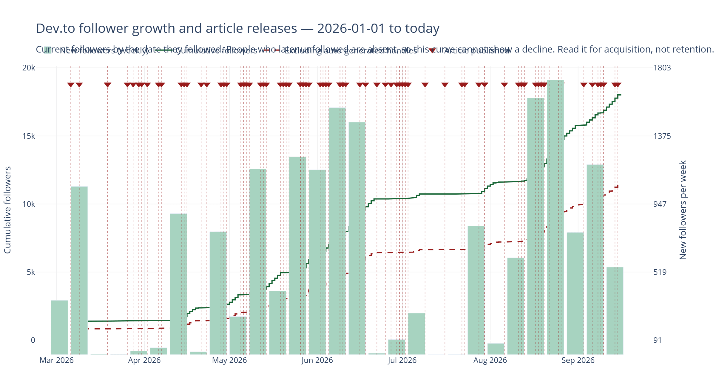
There is a catch worth stating plainly, because it took me a moment to see it. You only receive people who currently follow you. Anyone who followed and later unfollowed has vanished from the dataset. So the curve is “current followers by acquisition date,” not your follower count as it stood on any given day. It increases monotonically by construction and can never show you a decline that actually happened.
For working out which posts drove acquisition, fine. For anything about retention, actively misleading.
Trick Three: The Analytics Endpoints Exist and Are Barely Documented
There is a whole analytics family that most third-party tooling ignores:
/api/analytics/totals               lifetime views, reactions, comments
/api/analytics/historical           daily series over a date range
/api/analytics/past_day             hourly, last 24 hours
/api/analytics/referrers            where the traffic came from
/api/analytics/follower_engagement  follower growth over time
/api/analytics/dashboard            totals + history + top posts, bundled
All accept article_id to scope to a single post. Two things to know.
The responses nest. They are not flat integers:
{"page_views": {"total": 246454, "average_read_time_in_seconds": 306}}
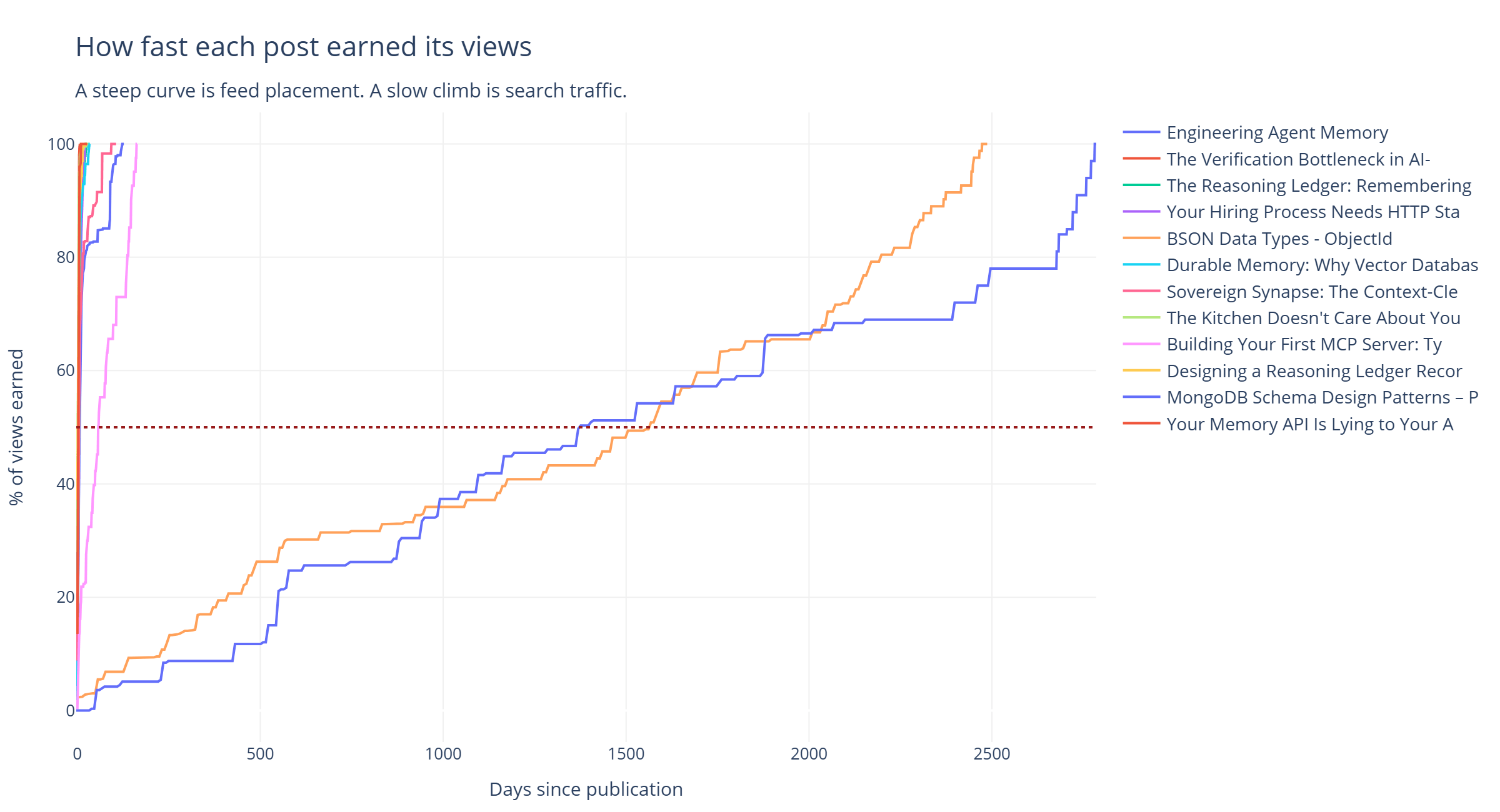
And the historical data degrades as you go back. For my 2017 posts the endpoint returns weekly buckets rather than daily rows, and in aggregate accounts for only about 15% of those posts’ lifetime views. For 2019 it covers 95%. For 2026, 100%.
That matters more than it sounds. I computed a “half-life” for each post, meaning days from publication until it had earned half its views to date. My first attempt confidently reported that several 2017 posts had half-lives around 3,000 days. They do not. The endpoint simply does not remember most of what those posts earned, and dividing a remembered fraction produces a precise, authoritative, meaningless number.
The fix is a coverage gate:
lifetime = article["page_views_count"]
tracked = sum(daily_series.values())

# A series accounting for 15% of a post's views will still yield a
# confident half-life. It will be an artifact of what the endpoint
# retained, not of how the post aged.
if lifetime and tracked < lifetime * 0.8:
    continue
Eighty-two of my 130 posts survive that gate. The median half-life among them is four days.
Trick Four: Some Metadata Is in the Markdown, Not the JSON
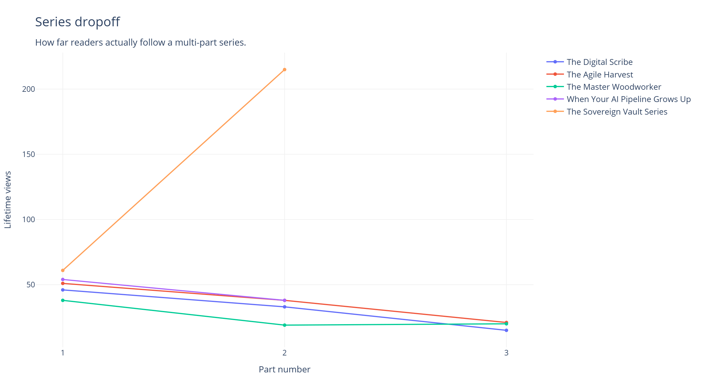
I write multi-part series. None of my posts came back with a collection_id, which is the field you would reach for to group them.
The series are right there in the Dev.to UI. The article serializer just does not include the field.
But /api/articles/me/published returns body_markdown, front matter and all, and the series name is sitting in it:
FRONT_MATTER_SERIES = re.compile(r"^series:\s*(.+?)\s*$", re.M)

def series_name(article):
    body = article.get("body_markdown") or ""
    if not body.lstrip().startswith("---"):
        return None
    parts = body.split("---", 2)
    if len(parts) < 3:
        return None
    match = FRONT_MATTER_SERIES.search(parts[1])
    return match.group(1).strip().strip("\"'") if match else None
General lesson: when a field you expect is absent from the JSON, check whether the source document came back too. It often did.
Trick Five: Comments Arrive Pre-Threaded
/api/comments?a_id={id} returns comments as a tree, with each comment’s replies nested in children. The structure is doing analytical work for free, and flattening it while preserving depth takes about eight lines:
def flatten(nodes, depth=0):
    out = []
    for node in nodes or []:
        out.append({
            "depth": depth,
            "username": (node.get("user") or {}).get("username"),
            "created_at": node.get("created_at"),
            "text": strip_html(node.get("body_html")),
        })
        out.extend(flatten(node.get("children") or [], depth + 1))
    return out
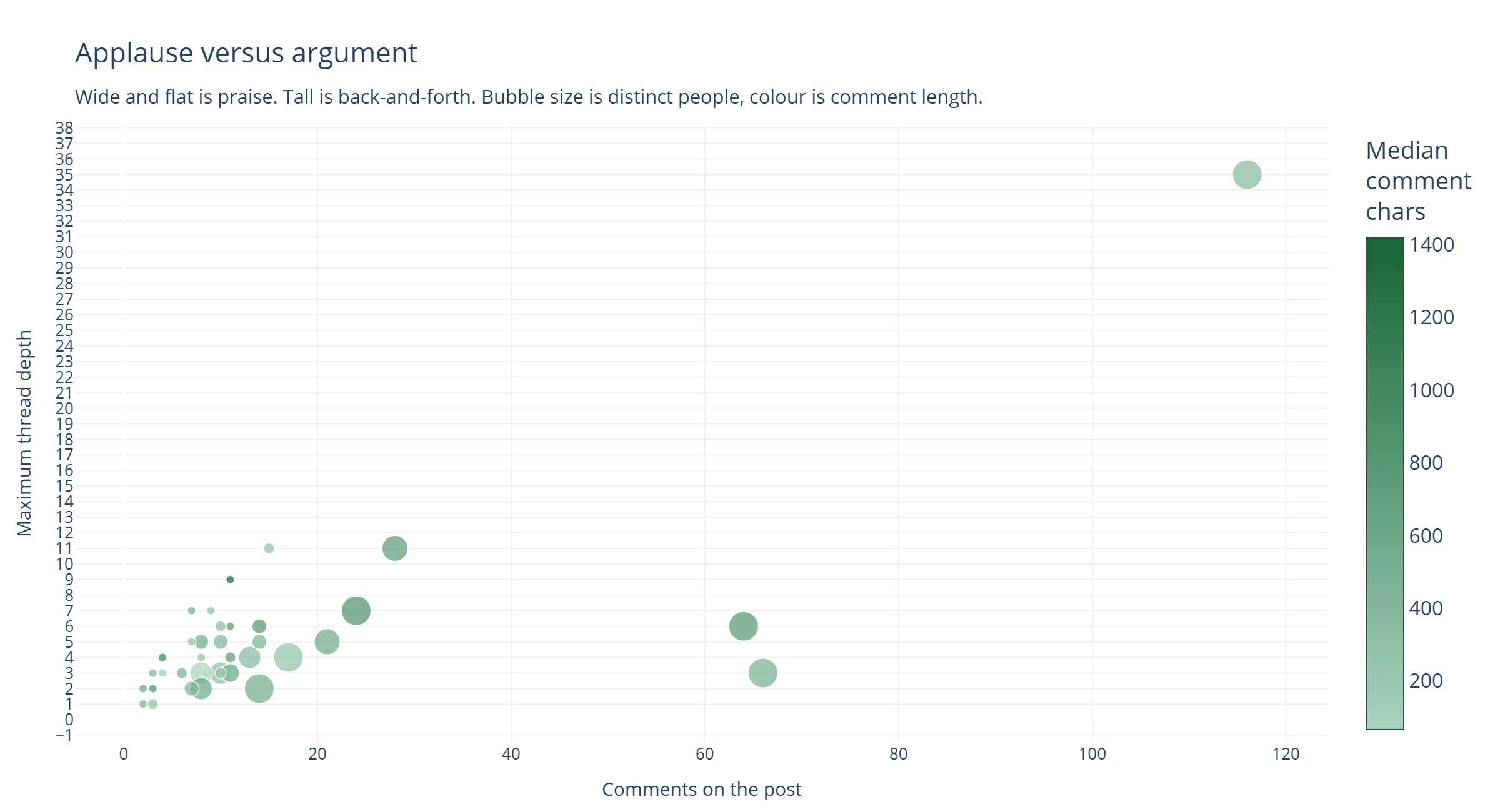
Depth is the metric that matters. Comment count cannot distinguish eight people each saying “great article” from two people arguing with you for four rounds. Maximum thread depth can. One of my posts has a thread 35 levels deep. That is not a comment section, it is a sustained argument, and no count-based metric would have told me it happened.
There is no endpoint for creating comments, incidentally. Replying still requires the browser. Probably deliberate.
What the Data Actually Said
Here is where the exercise stopped being a programming problem.
My follower count is not a readership number. I gained roughly 18,000 followers in 2026. My 2026 posts have 14,300 total views between them. You cannot acquire eighteen thousand followers from fourteen thousand views. The daily rate sits at a median of 136 with no meaningful response to whether I published anything, and about 37% of the usernames carry auto-generated-looking hex or numeric tails. That is reciprocal-follow farming, it is endemic, and it has nothing to do with me. It does mean the chart I originally set out to build could never have answered the question I was asking.
My most-viewed work is nine years old and no longer being read. My 2017 output was MicroPython, NodeMCU, and MongoDB tutorials. Forty-four posts from 2017 to 2019 pulled 32,474 views. Eighty-six posts in 2026 have pulled 14,300. But the daily series tells the other half: my 5,472-view NodeMCU post has had zero views in the last ninety days. Nineteen of my 130 posts are at zero for the quarter. Lifetime counters never decrease, which makes an archive look alive long after it has stopped breathing.
The engagement numbers invert completely. Those big old tutorials run about 2 reactions per thousand views. My 2026 essays run 56 to 72, with one at 71.6 reactions and 63.8 comments per thousand. Across the eras: 44 old posts drew 26 comments total. 86 new posts have drawn 606.
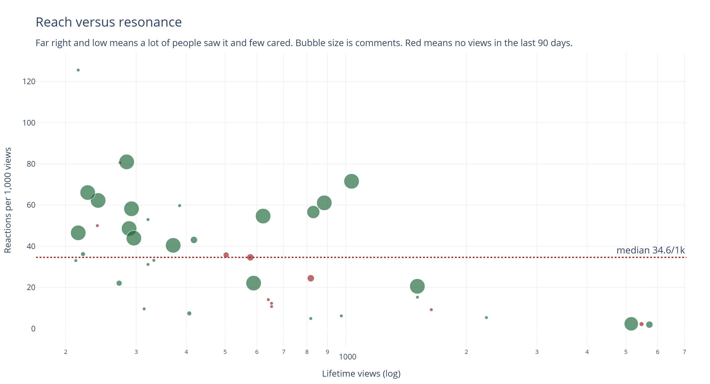
So one body of work got found and skimmed. The other gets read and argued with. They are different products, and I had been evaluating both with the same number.
Four percent of my traffic is Google. Direct or unknown is 74.5%. Internal Dev.to is 19%. For someone whose best-performing historical content is evergreen reference material, that is the number I find hardest to look at.
What I Would Tell Someone Starting This
Pull the followers once and cache them, because the dates reconstruct years of history you never thought to record. Gate every analytics computation on data coverage, because a partial series will hand you a confident wrong answer rather than an error. Read thread depth instead of comment count. And check body_markdown before concluding a field does not exist.
Mostly, though: separate the metrics that measure distribution from the metrics that measure whether anyone cared. Views, follower counts, and impressions are the first kind. Comment depth, reply rates, and the fact that the same four people keep showing up in your threads are the second.
I spent nine years assuming the first kind was the scoreboard. The API took an evening to tell me otherwise.